Microblog
About
Welcome to my Microblog! This is where I store all my micro thoughts. Tiny, delicate thoughts. Handle with care. It also generally stops me from getting into arguments on social media.
Please note that I am a living person whose opinions and perspectives might have changed since I wrote these entries!
2025 Entries
15/10/25

Spent most of today looking for Blinkies to add to my Stash.
I came across an old anime freeware graphics website, which was aesthetically absolutely amazing. But on their "fonts" page, they include the following disclaimer:
"Here are some fonts that you can use in your computer and websites. We do not own and did not create any of these fonts, but since you got them here we require you to LINK BACK to us."
Yeah... I don't think that's how that works.
13/10/25

I had a dream last night that Fortnite added a new item called El Pinto Lindo, who was a little round red man with a moustache and sombrero.
You could send him out to collect items for you, but he was only about 10cm tall and he didn't move across the map very fast.

03/10/25
Achievement Unlocked!
Completed Crushes Shrine 2.0
My head hurts!
24/09/25
Achievement Unlocked!
Completed Media Log Page
My head hurts!
Achievement Unlocked!
Completed Shrines Page
My head hurts!
19/09/25
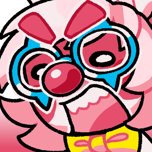
If you're all by yourself (usually by the shore), and there's eggs near you, and there's 5 seconds left on the timer, and we need one egg to win, don't just stand there spamming "This Way!". Take the egg yourself!
It doesn't matter how many times you say "This Way!", I'm not going to spontaneously teleport next to you. Do you think the rest of the team is doing nothing over here? Do you not see the cluster fuck of steelheads? The flyfish? The fish sticks? Are the bosses that you kill the only ones that matter? Are your eggs somehow more special?
We can't make it to you and back in time! But you might be able to make it to the basket on time! Wtf is standing still going to accomplish? Are you scared? Do you need me to hold your hand?
Sometimes I genuinely wonder if I'm the only person on my team who can see the timer countdown and the egg quota.
Achievement Unlocked!
Completed Micro Blog Page
My head hurts!
2024 Entries
04/10/24

For as long as I have had an Internet connection, I have been reading fanfiction. I began on Fanfiction.net, but moved to AO3 when Fanfiction.net started banning all the NSFW fics (or lemons, as we called them). I have even written and published a few of my own (but I'll never tell you my username!!)
I grew up within this culture. And, while I do not believe in gatekeeping, I see many new people entering this space lately and basically making a fucking mess. Those who do not learn from history are doomed to repeat it, and I see these fandom babies retreading old Earth and, worryingly, calling for censorship in a way that runs totally counter to the culture's core ideals.
So here's a half-ramble, half-analysis of what the fuck is up with the current state of shipping culture.
Attitudes towards shipping have always been split into two unspoken categories, which I have named as such:
Action-Figure Shipping is essentially just smashing action-figures together. You take your Boba Fett action-figure and your Legolas action-figure and you make them kiss. There can be some regard for canon, but this shipping is done primarily for the fun and enjoyment of playing out scenarios with your favourite characters. It is not a form of endorsement for these scenarios, or a letter to the original creator of the work to make these scenarios canon. Rather, it is play in it's purest form, and the form of shipping I engage with the most.
Endgame Shipping is shipping that focuses on the potential outcome of a piece of media. These ships are shipped with the intention that these characters will canonically end up together at the end of the original work's storyline. Harry Potter was full of ships like this during the original publication, the most controversial of which was Dramione (a ship between Draco and Hermione). This shipping is often the most mainstream accessible form of shipping. Regular, offline people bought "Team Edward" or "Team Jacob" shirts during Twilight's hayday.
While I engage with Endgame shipping much less, I do see it as a valid fandom activity. It's sort of the sportsball-ification of shipping. You get to pick a team and root for it, and rally around it with like-minded people. However, this also leads to more toxicity than Action-Figure shipping. If you're rooting for a team to win, it also means you're rooting for the other teams to lose.
There's also a natural tendancy for Endgame shippers to assume that all shipping is Endgame shipping. So, they become confused when they see Action-Figure ships that make no goddamn sense in canon, or would be actively kind of gross and uncomfortable in canon. This is also the default response the non-shipping general public has to shipping - "What do you mean these two men are in love?? They're literally just standing next to eachother."
I'm not saying that Endgame shippers are tourists, just that it's the easiest form of shipping to engage with, and therefore is often populated by people who engage with fandom in a more traditional, canon-centric sense..
I first brushed up with the concept of Anti-Shippers during the Great Reylo War.
When the Star Wars sequels were coming out, Reylo, a ship between Rey and Kylo Ren, quickly became the most popular ship. The ship was popular because Kylo Ren is a tormented goth boy with a six pack, and people wanted to see Rey fix him. Also, to anybody actually paying attention to the films (And Star Wars' history of redeeming bad guys and making people who initially hate eachother kiss), Reylo was the very obvious endgame. However, it was also very controversial. Kylo Ren is a space Nazi who tortures people and tries to kill Rey and all of her friends.
So, the fandom split into two teams. Pro-Reylo and Anti-Reylo. Over time, the Anti-Reylo brigade just became shortened to "Antis". And history was made.
As somebody outside of the Reylo fandom (I don't care enough about Star Wars to ship anything), I mostly only heard about these Antis from their absolutely unhinged behaviour. At one point, a notable fandom elder in the Anti community branded all the Reylo fans as racist, as she believed people were shipping Rey with Kylo Ren rather than Finn because Finn is played by a black man. Thus, the argument became that people would rather ship Rey, a white woman, with a murderous space Nazi rather than a nice black man, solely because he's black.
This lead to severe harrassment campaigns against Reylo shippers, one of which was Jenny Nicholson, who had her tweets doctored to make her appear outwardly racist against Finn's actor. You can see the tweets here.
As somebody who primarily engages in Action-Figure shipping, and somebody with common decency, this seemed absurd to me. Somebody shipping Reylo doesn't stop the Finnrey shippers from shipping Finnrey. AO3 is big enough for both to exist.
But this is Endgame shipping. There are stakes involved. Rey can only canonically be with one of these boys!!! And if you ship her with the space Nazi, that means you want her to end up with the space Nazi in canon, and that obviously means you support space Nazism.
But Anti-Shipping is now a term that is not unique to Star Wars. Instead of being against one particular ship, they're against any ship that doesn't follow their specific moral code. This idea of depiction = endorsement can be found everywhere in every fandom space, even ones where its incongruous with the source material.
Their mentality is that you can enjoy Game of Thrones and all of its incest storylines, but if you ship a character with their relative, you obviously support incest.
But it also goes further than that. Because the scope of their morality is completely out of wack. Shipping characters who are children? That's pedophilia. Aging up child characters so you can ship them? That's pedophilia. Age gap relationship between two legal adults? That's pedophilia. Shipping characters who are in a found family? Incest! Obviously! It has family in the name!!
It spills over into actual ableism, too. Hannibal is a TV show about a cannibalistic therapist who is in love with his patient, Will Graham. He is deeply possessive of Will, tries to eat him on several occassions, allows his mental health to deteriorate to frames him for murder. A lot of red flags, we can all agree. But to some Antis, the real problem with their relationship is that Will is autistic-coded, and therefore unable to consent.
Will Graham is a very competant, adult man. He even has sex with people in canon!!!
And of course, to any reasonable person, there is no problem with shipping Will and Hannibal because it's a fucking TV show. About cannibalism. And how being an empath gives you psychic powers.
If you have a problem with Hannibal and Will's relationship as depicted in fanfiction, you should logically have a problem with how it's depicted in the literal show itself. Because Hannibal and Will are canon. They are endgame. The shippers won.
But they won't because they like watching Hannibal. So they just argue that Hannigram shippers are watching the show incorrectly, so they can maintain their position of moral superiority.
To be a pro-shipper, that is to say "somebody who ships whatever they want and lets other people ship whatever they want, and just avoids the ships they dislike" is not to be some new, nasty, predator scheme. It's the default rules that most shippers have operated under since fanfiction's inception.
Wrapping yourself in layers of nonsense moral code to justify liking what you like is so pointless, when you could just like what you like. And let other people like what they like. And block the stuff that makes you upset, instead of actively seeking it out and yelling at people.
And there's something about that dynamic that deeply worries me. Big-name Antis, who are usually adults, often present themselves as the voice of all reason to a hoard of impressionable teenagers. They present their Discord servers as safe-spaces, free from predators (pro-shippers). And then they police the sexualities of these young people. They show them examples of the types of porn they "should be avoiding".
How is that safer than pro-shippers, who are usually the first to tell teens to fuck off and get out of their adult spaces?
There are teenage Antis on TikTok who live in actual fear of enjoying pro-fic content. They feel anxiety over being attracted to characters who are a year or two younger than them. They dread becoming 18 years old because they'll suddenly have to stop finding a 17-year old anime boy hot.
Anti mentality isn't new. It's what lead to the Fanfiction.net purge in the first place. It's what inspired some incest shippers to create AO3.
But Anti mentality is so prevelant now. And I believe it's due to the mainstreamification of fandom culture. Now, everybody wants to be part of a fandom, but they don't take the time to learn how any of it works. They approach from the most mainstream-suitable form of shipping, Endgame shipping, and view everything through that Shipping = Endorsement lens.
And honestly? I'm terrified. Because the harrassment campaigns only continue to grow. And because I ship whatever the fuck I want. And I'm scared that I'll say the wrong fucking thing on social media and have a hoard of puriteens banging on my door.
I don't even ship anything that crazy. You can see my favourite ships over in my shrine. But Antis don't play by consistent rules at the best of times.
Thankfully, most of my current active fandoms are occupied by adults, which mitigates some of this nonsense. And I'm also very liberal with the block button (as all people should be, Antis especially).
But I genuinely worry about the kids who grow up in this culture - The ones who expect fandom to be catered to their tastes, and look to weird, puritanical adults to keep them safe. The ones who might discover they have a common fetish and spiral about it for months. Or who, God forbid, experience some form of trauma and want to create art to help them cope with it, only to be demonised by their friends, and are forced to reveal their trauma to prevent being ousted from the Internet entirely.
And when Fanfiction.net purged the NSFW fics, it came for the queer fics first. It's worrying that so much Anti rhetoric reflects conservative views on sexuality. It really feels like we're taking so many steps backwards.
28/09/24

This story contains non-graphic discussion of a non-fatal rollercoaster accident.
Whenever I get anxious, I get stress dreams. Stress dreams aren't really scary enough to be nightmares but they're permeated by an overwhelming sense of unease. Most of my stress dreams take place in theme parks, where I get lost in the park, get into a huge argument with my family, or get trapped on a ride.
Many of these stress dreams revolve around one particular rollercoaster I went on when I was around thirteen-ish. I won't say the name of this coaster or the park where this occured, but if you do any type of Googling, you can probably figure it out.
The park in question is a slightly shitty local theme park. At the end of the school year, my secondary school would organise a trip to the park where us students would be set loose for the day to do whatever we wanted.
I should mention, I love rollercoasters. I'm not an expert and I haven't been on too many, but I'd say I enjoy them more than the average person. So this trip was always super hype for me.
So on the day in question, it was me and two of my friends, boiling summer heat (for British standards), and we're about to go on a spinning wild mouse coaster.
As is fairly typical for these types of coasters, the car of this coaster sat four people, split into two sets of two, seperated by a plastic ridge in the middle. Because there was an odd number of us, and I was braver than my friends, I decided I would sit by myself. There was a lap bar that spread across the two seats, and a seatbelt for each individual seat. Also, for extra context, this was a coaster where you had to get on it while it's still moving, as there was usually two cars on the track at one time.
So, I sit down in my wide seating section and realise that my seatbelt doesn't work. It just won't buckle at all. I try to move to the next seat along, but the ride operator tells me to sit at the centre (this was presumably for weight distribution).
Obviously, I tell her that my seatbelt is broken.
To which she replies "Uhhh... You don't need it."
And then she sends us on our way.
I assumed, being a generally trusting person, that the seatbelt is only there as a formality - A failsafe in case the lap bar popped open. So I wasn't too concerned. (Little did I know at the time that this theme park had a problem with another ride's lap bar popping open mid-ride, but that's thankfully not what happened to me that day.)
That said, the ride experience was one of the more intense ones I've ever had. I was fairly underweight at this point in my life, and the track had many sharp angles (Not to mention, the car fucking spins), so with every movement of the ride, I was sent ping-ponging back and forth across the seating section. I believe at some point, my friend sat at the centre linked my arm to keep me from sliding about, but it was kind of a blur.
So anyway, the ride ends. It was fun but scary. I move on with my life, not really thinking anything of it (although this is the point where I began having stress dreams of this coaster).
And then, a few years later, a seven-year old boy slipped out of the car of that coaster, fell the entire height of the track, and suffered "life-changing injuries."
The reason he slipped out? His seatbelt didn't work and he had been sat in a section by himself.
Obviously, there's a hell of a difference between a seven year old and a thirteen year old. I'm sure that I was genuinely safe enough on that coaster without a seatbelt.
Following this news, I felt some amount of guilt. Like, I should have told park management or something that the seatbelt was broken and it felt unsafe.
But then I looked at TripAdvisor and other sites' reviews for that particular coaster. And like 80% of them mentioned that the seatbelt was broken. People having to hold on to their relatives because they were sliding around the car and they were worried they could slip out.
The park management knew. They just didn't give a shit. Or truly couldn't afford to fix the ride. Or both. In fact, the fact that so many reviews mentioned a broken seatbelt makes me wonder if it wasn't just one car with a broken seatbelt, but all three.
A few years after the incident, the park decided to close all large-scale coasters and pivot entirely to flat rides that appeal to the under-eleven age demographic.
I was fairly pissed at this news. The only other theme parks remotely close to me were both way more expensive and would probably require an overnight stay. Not to mention, this park used to have a record-breaking rollercoaster. It was slightly shit and only really got the record due to technicality, but still.
But honestly, it's for the best. The park clearly couldn't be trusted to keep people safe, and it was struggling to keep the rides maintained or bring in new ones.
I don't want this entry to scare people away from rollercoasters, or supporting local small parks, but I guess I do want people to look at the reviews of a ride before you decide to get on it. And, even if you're an awkward teen who just waited like 30 minutes in the heat to get on a coaster, and the coaster car is actively moving, you should do anything in your power to not ride a rollercoaster with a broken fucking seatbelt.
23/09/24

Stumbling around NeoCities this morning and I came across a pixel art site, by an actual pixel artist, who was also offering free website layouts that used fucking AI generated art.
Like at least they were honest that it was AI generated, but fuck me. Great way to make your layout look like shit and for me to lose all respect for you as an artist.
21/09/24

It's early in the morning and I haven't had a cup of tea or any food yet, so this entry might be fairly incomprehensible.
Been thinking about the site, as always (This entry is sort of piggy-backing off of yesterday's entry). Still trying to resolve the design problems I've been having.
Obviously RabbitNET was based off of Rabbit B. Clowning, my VTuber persona. But the more I develop the site, the more it seperates slowly from their design. Most apparently is the colourscheme of the site, which is blue, green and red/pink, as opposed to Rabbit's red, blue and yellow. But also aesthetically. Part of my brain still associates the act of maintaining a website with the pre-2010s, so Rabbit's clothing and design feels a little anachronistic to me. As I said yesterday, my biggest design inspirations right now are mid-2000s MMOs like MapleStory and Gaia Online. There's no way Rabbit would exist in either of those worlds in her current state.
So now, Rabbit feels a bit incongruous to her own home.
But like.. I can't redesign her AGAIN. This'll be like her 6th design or something crazy. And even if I made a Rabbit design that's wholly unique to the site, I'd have to redraw every image of her on the site.
And then what if I get bored of this current aesthetic and re-design RabbitNET again?? Will I have to make another Rabbit design to fit?
I feel a bit stuck. Like I can't fully commit the site any aesthetic I like because it'll leave Rabbit behind, but I also can't redesign Rabbit without it taking time I don't have.
I also need a new website background, but I fucking hate drawing backgrounds. It's soo far out of my comfort zone. That said, I also can't find any background imagery from elsewhere I would want to use. I've toyed around with some DokeV (potentially cancelled MMORPG) promo art as a new background, and I do like how it looks, but the artist part of my brain is pissed that it isn't art that I've made myself (I appreciate the irony in saying this on a page that currently uses MySims Agents concept art as a background). Also, the DokeV style is a bit too realistic for the site, I feel like it needs to match the header better and be more cartoon-ish. But again, I can't find anything that fits that criteria yet...
20/09/24

Wow look at this! The start of a new blog.

Now that we're firmly into RabbitNET 2.0 and my Web dev skills are growing, I think it's a good time to take stock of where we are and where we're going, aesthetically.
The way I look at it, NeoCities websites can be split into three categories, design-wise:
- Maximalist/Deco-Heavy
- Old Web Emulation
- Contemporary Web Standards
Each of these design aesthetics has its own pros and cons.
Maximalist websites are by far the most "popular" designs on NeoCities. These are sites with very cohesive aesthetics and utilise a lot of hand-placed images. They're popular for good reason - they're usually beautiful and they require a lot of skill to create. They're an art form.
But as far as websites go, they're usually more form over function. They prioritise imagery over text content, which can feel a little shallow, and many of them end up abandoned or taking forever to update because each page is usually its own, totally niche design. This can also make navigation a pain in the ass for users - if every page looks totally different, your brain has to re-orient itself everytime you enter a new page.
On the other hand, sites that emulate the old web are typically a blend between form and function, although the form can be a bit ugly. Their CSS is simple and cohesive, so navigating the website is easy. However, they can be prone to eye-strain, especially with some awful tiled background choices.
Contemporary web design is pretty boring. But it works! It's totally function over form, with the design being as unobtrusive as possible to push the content of the site to the forefront.
So where does RabbitNET fit into this?
My goal with RabbitNET has always been to make it as easy as possible to update. I don't want a pretty picture, I want a website that functions as a website. I want people to be able to visit this website and navigate it easily, not just look at it in awe.
... That said, I also want it to look nice. There's an awful bastard artist part of my brain that looks at other people's pastel kawaii decora emo blinkee vomit eye-strain site and gets pissed that RabbitNET doesn't look like that, even though it runs completely counter to the type of site I want to maintain.
So, I'm trying to carve out a nice aesthetic without compromising form too much. Aesthetically, right now I'm drawn to web design of roughly 2008. Most of the sites I'm drawing inspiration from are MMO websites like Habbo and MapleStory. I like shiny web-design. Too flat to be Frutiger Aero, not elaborate enough to be Frutiger Metro, but something along those lines. Fruitiger Gummy, perhaps. Yum.
And, of course, I've got my shrine pages for more elaborate designs, or at least sampling different aesthetics.
It's just been a little frustrating trying to hone in on the aesthetic I want for the main site when it doesn't fit into any pre-existing standard, as far as I can tell.


